The iconic commuter favourites
Spotted on trains and at picnics throughout the nation… my design for these trusty little cocktail cans combines quality alcohol cues with vibrant shopability


Photography credit: M&S
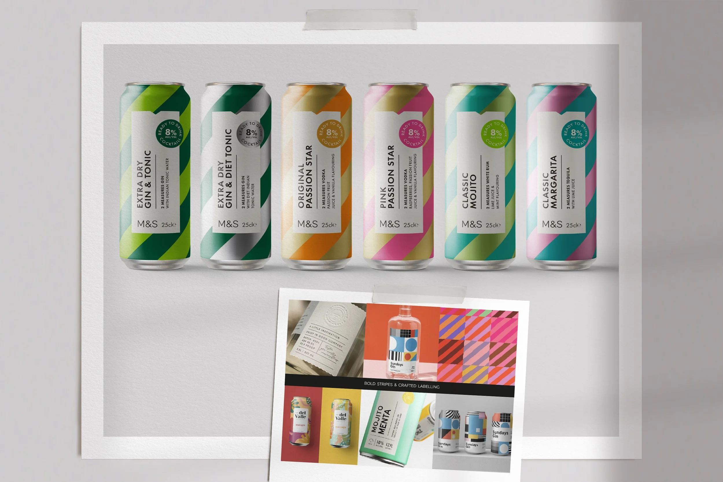
Taking cues from the crafted typography of spirits labelling, CONCEPT 1 combined alcohol quality cues with simple, bold stripes which would give a very strong visual effect on shelf. The label device was positioned in the optimal place on the can, above shelf strips and below the glare of fridge lighting
Differentiation between the G&T and Diet G&T was created by using the silver of the can on the Diet version
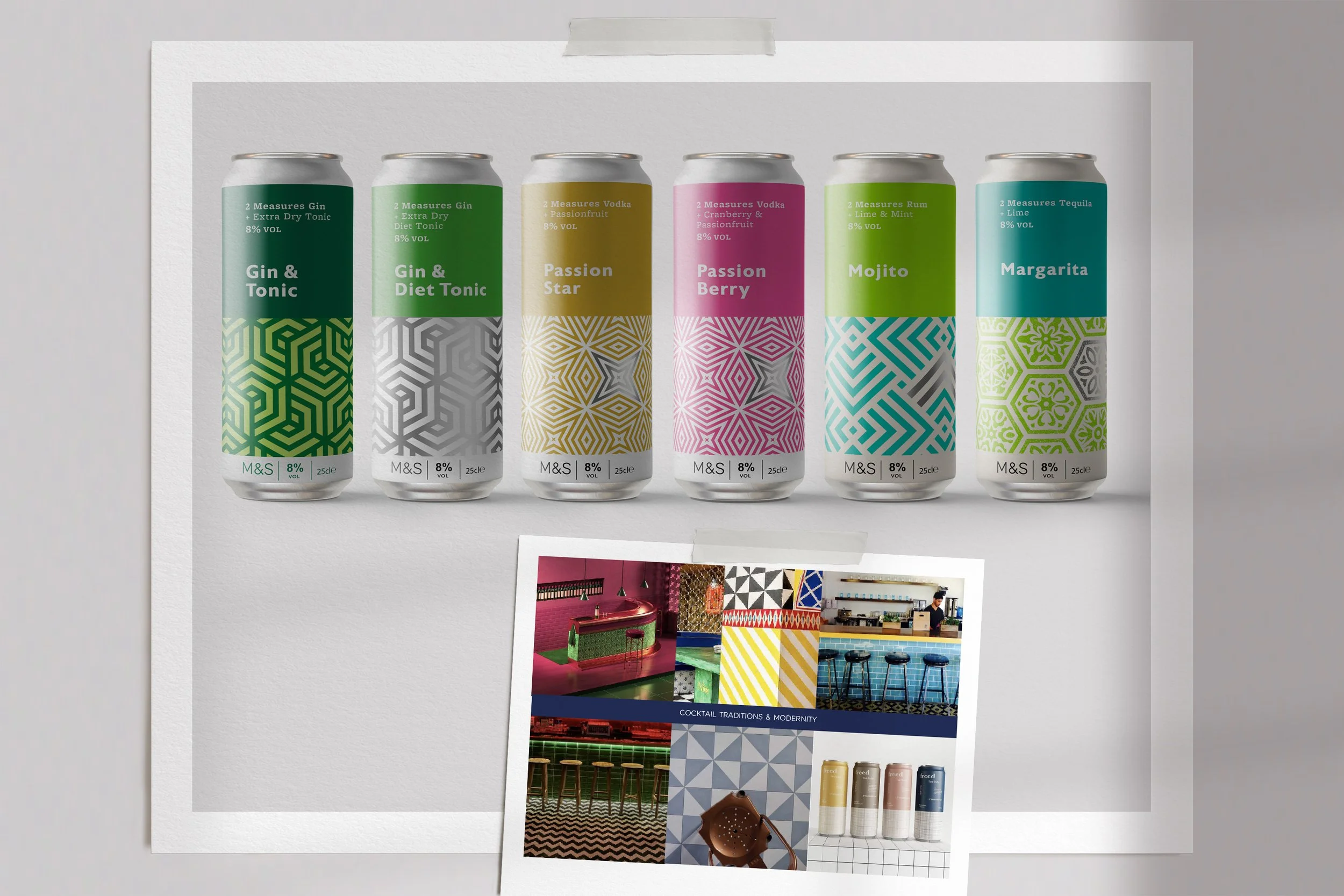
CONCEPT 2 was based on the graphic tile patterns found in the interiors of cocktail bars around the world. The intention was to have a signature pattern for each flavour. This decorative element was balanced with bold contemporary typography and colour blocking
The silver of the can was used in the pattern to ensure enough differentiation betwen the G&T and Diet G&T
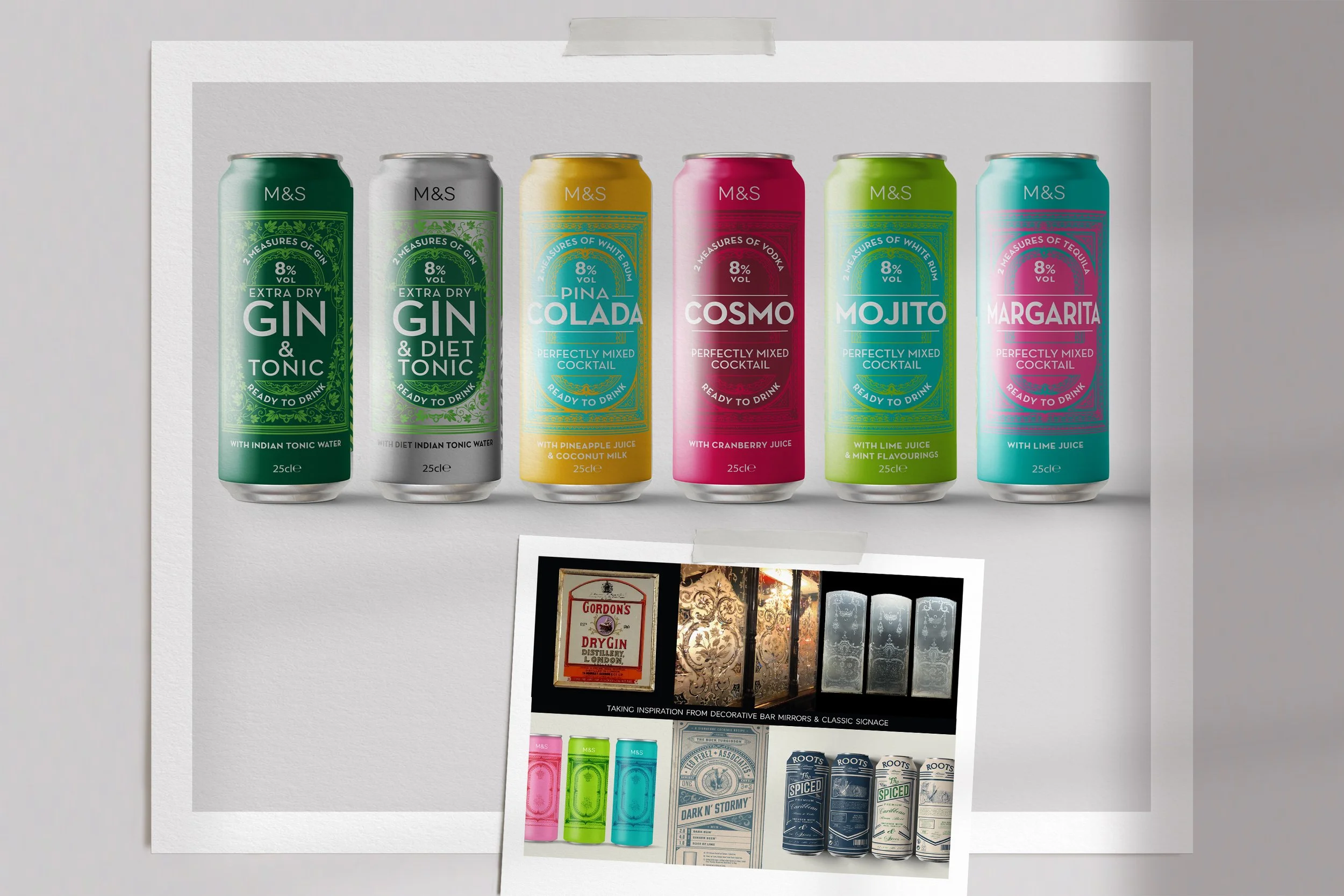
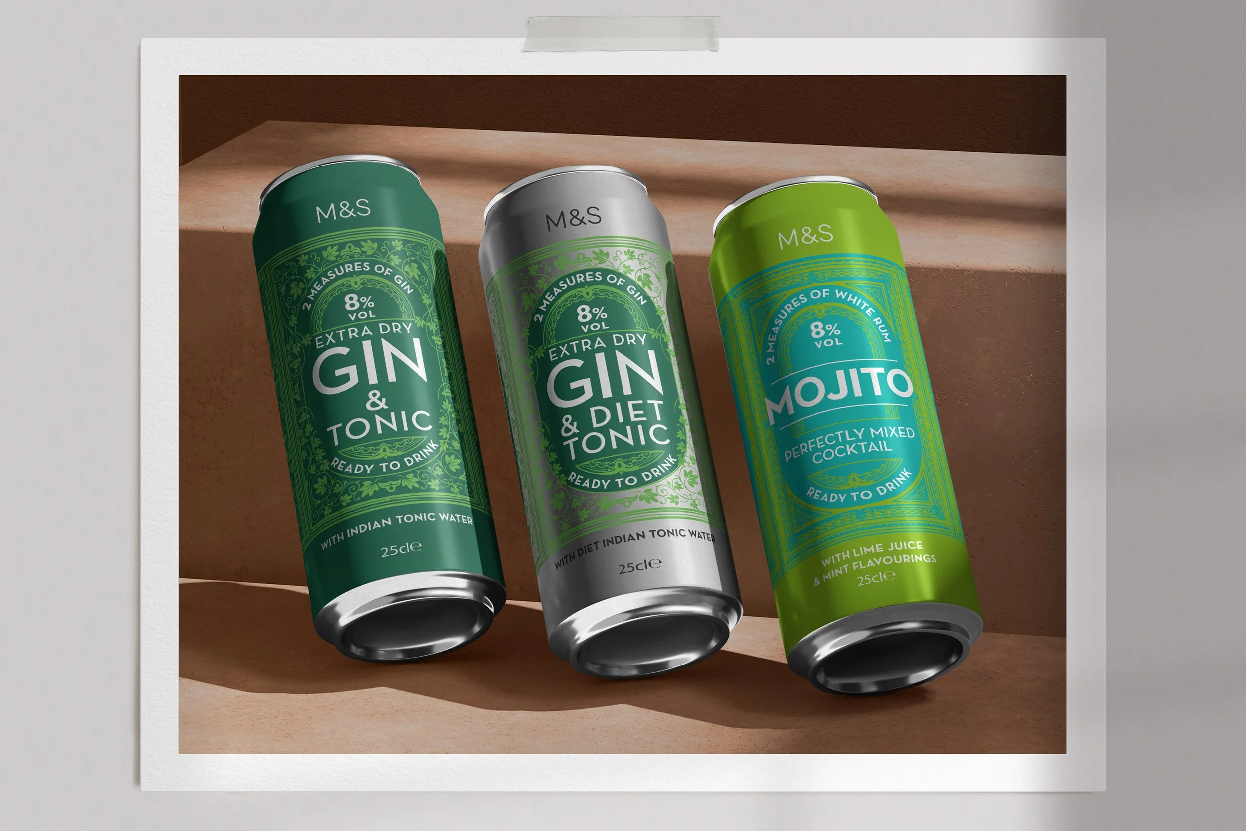
Inspired by Victorian bar mirrors, which have etched patterns in the glass and old style typography, CONCEPT 3 was chosen for it’s ownability. It was a natural transition from the old design, sharing the same font and colour coding, whilst adding more quality alcohol cues and bold colour contrasts
All the G&T, Diet G&T and flavoured G&Ts in the range shared a botanical frame pattern, whilst the other cocktails had a more graphic, abstract framing device
Once the concept was chosen I then applied it across all the can variants and onto 4 Pack designs
Future proofing the design, with comprehensive guidelines to allow seamless range extensions was the final part of the project. I worked with a Creative Artworker to map them out clearly and ensure they followed the original design intentions
Photography credit: M&S